Keyboard Input—Typing Practice w/ Machine Learning
Disclaimer: although this series is about machine learning, this post won't have any in it.
Articles in this series:
The finished project is located here: https://www.bayanbennett.com/projects/rnn-typing-practice
Requirements
- Displays an area that the user will have to activate
- Displays a sequence of letters
- Receives keyboard inputs
- Compares input to the current letter
- Progresses from one letter to another with the correct input
- When the cursor reaches the end of the line, it moves onto the next line.
Letters
Requirements met:
- Displays a sequence of letters
I was curious to see what others have produced. Here are some popular implementations:
10fastfingers.com

The target text and typing area are separated. Hitting the space bar updates the target text and clears the input. Words that are currently being mistyped are highlighted in red. Uncorrected mistakes have a red font color.
The separation of the typing area and the target text was a bit jarring. Any time that I had to look at my text to correct a mistake, I had to take my eyes off the target text, which made it difficult to keep any flow going once I hit a mistake. Sometimes it was easier to skip the word entirely than to try and correct it.
typing.academy

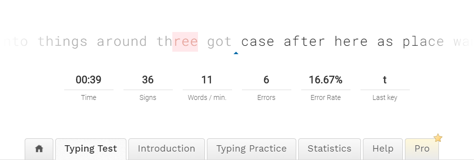
A triangle marks the current position of the cursor. When a mistake is made it won't let the user proceed until the mistake is corrected. Afterwards, it marks errors with a red letter. Although this approach of keeping the cursor in the middle and pushing the text past the user may look fancy, but it didn't have the right feel to it.
- Our eyes naturally glance ahead to see what's coming. Under normal circumstances, the words would not be moving during that glance. In this case we must hit a moving target with a glance.
- Our eyes also need to move while reading the word we are typing.
- Most screens do not have a refresh rate above 60Hz with low persistence, so the moving text is even harder to read because it smears while it is moving.
keybr.com

The cursor is a blinking rectangle, like something that you would find in a terminal. Once a letter is typed, it turns grey if you got it right and red if you've made a mistake. The page won't let you proceed to the next character if you don't get it right... well, up to a point. There is an exception that if you start typing the next word correctly, it will just skip on to that word. What I liked from this page is that you didn't have to interact with the page if you wanted to continue practicing.
typingclub.com

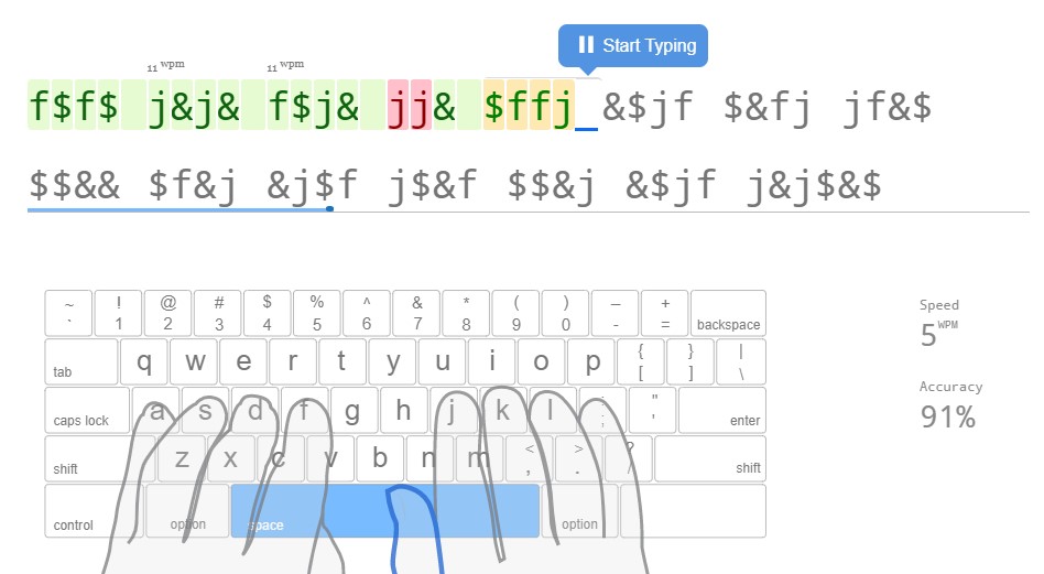
This site was the most feature rich of the bunch. Green for when you got the letters right, red for when you got them wrong, and yellow for when you corrected them. The cursor is a blue underscore. Once you've finished your lines, you must interact with the page to get to the next lesson.
My Implementation

Some of the obvious choices:
/* use the browser default monospaced font */
font-family: monospace;

/* remove the margins */
margin: 0;

/* center the child elements */
display: flex;
flex-flow: row nowrap;
Originally, I had designed something like typing.academy, but I wasn't happy with it for the reasons mentioned in the typing.academy section. I liked the way that keybr and typingclub had approached this problem. The one thing that I wanted was to have a continuous flow of text for the user to type.
To accomplish this, I used an array of 5 lines.
| Index | Description |
|---|---|
0 | Hidden line |
1 | Previous line |
2 | Current line |
3 | Next line |
4 | Hidden line |
When the user completes typing a line the 0 line is removed, the next line is generated and concatenated to the end of the array of lines, bringing the number of lines back to 5. The trick that makes all this work is transitioning the heights of the lines:
1➡0: where the height shrinks to0px4➡3: when the height grows to1.5em
The logic that sets the height is in the final styled component below. In that same component, the opacity is also set as 0.1 for all lines that are not the current line.
Here's the final styled component:
const Letters = styled.h1`
  font-family: monospace;
  margin: 0;
  display: flex;
  flex-flow: row nowrap;
  justify-content: center;
  transition: height 0.3s ease, opacity 0.3s ease;
  /* Sets the height and opacity based on the index of the line */
  height: ${(p) => (p.index === 0 || p.index === 4 ? 0 : "1.5em")};
  opacity: ${(p) => (p.index === 2 ? 1 : 0.1)};
`;
Letter
It was interesting how different sites approached spaces. I liked how keybr.com used a marker to specifically denote spaces. However, I chose to go with a small bullet (·), as that's what's used as a space when you click the ¶ symbol on MS Word to show the hidden formatting symbols.
const Letter = styled.span`
  position: relative;
  opacity: ${(p) => (p.prev ? 0.3 : 1)};
  transition: opacity 0.3s ease;
  ::after {
    opacity: ${(p) => (p.current ? 1 : 0)};
    position: absolute;
    content: "🔺";
    font-size: 0.4em;
    text-align: center;
    bottom: -1ch;
    left: -0.5ch;
    right: -0.5ch;
  }
`;
Relative positioning is just so that the ::after pseudo-element is absolutely positioned and needs something to anchor to.
When the character is a current character, we want the arrow to be beneath it. When a character is a previous character, it should have an opacity of 0.3.
Input field
Requirements met:
- Displays an area that the user will have to activate
- Receives keyboard inputs
Why is this necessary? It's not.
In any website running JavaScript, it's possible to have any element listen for a keypress without the average user being aware of it. Kind-of scary, right? This is one of the many reasons why XSS is so dangerous, it doesn't take much to turn a webpage into a keylogger.
Having a dedicated input element solves two problems:
- It gives the user some confidence that their keypresses aren't being listened to unless they click on a button. It's not a guarantee, but it at least tells the user that this is something that was thought of.
- It allows mobile users' keyboard to pop up when they tap on the input area.
Although this application is not designed for mobile use, it's still a nice touch for users to be able to use the app on mobile.
Attributes
value="" | to make sure the input area starts with an empty string |
placeholder="CLICK TO ACTIVATE" | this text will show when the input is not focused |
autoCapitalize="none" | prevents mobile keyboards from capitalizig the first letter |
autoCorrect="false" | prevent auto-correct |
Here's what the final component looks like (written using styled-components). Any reference to p.theme is from Material UI's theme
const Input = styled.input.attrs({
  value: "",
  placeholder: "CLICK TO ACTIVATE",
  autoCapitalize: "none",
  autoCorrect: "false",
})`
  resize: none;
  position: absolute;
  left: 0;
  top: 0;
  right: 0;
  bottom: 0;
  width: 100%;
  height: 100%;
  opacity: 0.87;
  z-index: 1;
  cursor: default;
  border: none;
  border-radius: ${(p) => p.theme.shape.borderRadius}px;
  margin: 0;
  background-color: ${(p) => p.theme.palette.primary.main};
  text-align: center;
  transition: box-shadow 0.1s ease;
  ::placeholder {
    color: ${(p) => p.theme.palette.primary.contrastText};
    ${(p) => p.theme.typography.h5}
  }
  :focus {
    background-color: transparent;
    cursor: none;
    color: transparent;
    box-shadow: ${(p) => p.theme.shadows[8]};
    outline: none;
    ::placeholder {
      color: transparent;
    }
  }
`;
Keyboard Inputs
Requirements met:
- Compares input to the current letter
- Progresses from one letter to another with the correct input
- When the cursor reaches the end of the line, it moves onto the next
Getting the input is as simple as adding an onChange attribute to the Input element. Before sending the value to the handleKeypress action, it is lowercased and converted to an integer from our set of valid characters.
<Input
  onChange={
    ({ target }) => dispatch({
      type: "handleKeypress",
      payload: char2Int(target.value.toLowerCase())
    })
  }
/>
dispatch is used because I'm using reducers to manage my state (see: useReducer)
const handleKeypress = (state, charInt) => {
  const {
    linesOfText,
    cursor,
    prevTime,
    prevCharInt,
    mlKeyboardWorker,
    bigram,
  } = state;

  // If there aren't enough lines, do nothing
  if (linesOfText.length < 3) return state;

  // Get the current time (higher precision than Date.now())
  const keypressTime = performance.now();

  // Check that the pressed key is the current key
  const requiredCharInt = linesOfText[2].keys[cursor].charInt;
  if (charInt !== requiredCharInt) return state;

  // Record the duration between keypresses
  const duration = keypressTime - prevTime;

  // If the previous pressed key exists
  // and the duration is less than the maximum allowed,
  // save the duration to our bigram
  if (prevTime !== null && prevCharInt !== null && duration < MAX_DURATION) {
    const {
      [prevCharInt]: { [charInt]: prevTime = null },
    } = bigram;
    bigram[prevCharInt][charInt] = calcEma(prevTime, duration);
  }

  // Increment the cursor
  const nextCursor = cursor + 1;

  if (nextCursor < MAX_LENGTH) {
    return {
      ...state,
      linesOfText,
      cursor: nextCursor,
      prevCharInt: charInt,
      prevTime: keypressTime,
      bigram,
    };
  }

  // Handle what happens at the end of the line

  // Remove first line
  linesOfText.shift();

  // Send a message to our web worker to get the next line
  mlKeyboardWorker.postMessage({
    type: actionTypes.worker.getNextLine,
    payload: bigram,
  });

  return {
    ...state,
    linesOfText,
    cursor: 0,
    prevCharInt: null,
    prevTime: null,
    bigram,
  };
};
Summary
Here's a quick recap of the requirements
- Displays an area that the user will have to activate
- Displays a sequence of letters
- Receives keyboard inputs
- Compares input to the current letter
- Progresses from one letter to another with the correct input
- When the cursor reaches the end of the line, it moves onto the next line.
It's always special when a project includes a tactile component. Playing with a new feature and seeing how things feel leads to well informed design decisions.
The last part of this series is about inference using TensorFlow and Web Workers!