Markdown with Custom Components in NextJS | DevLog 007
In the last post I used .js files as a source for code snippets for generated pages in NextJS. I have two problems with this approach:
- Only one code block per page.
- Difficult to add additional (non-code) content to the page.
This could limit the effectiveness of the page as a resource for software engineers. The objective isn't to recreate MDN, rather, to provide users with a brief overview with interactive examples.
I thought of making a separate markdown file for the contents of the page, but then I realised that I could just map the code blocks to the code editor component.
Added Dependencies
npm i react-markdown rehype-autolink-headings rehype-slugMoving to Markdown
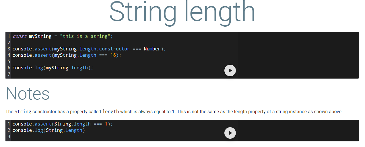
I renamed all the .js files to .md files and wrapped the code in a markdown code block. I also added a heading for each file. I may decide to remove it in the future.
+ # String
+ ```js
const doubleQuoteString = "this is a double quote string";
const singleQuoteString = 'this is a single quote string';
const backtickString = `this is a backtick string`;

/* ... */

console.log(doubleQuoteString, singleQuoteString, backtickString);
+ ```
[…path].tsx
The code for this file is mostly unchanged, the main difference is that the page template receives a prop called markdown which is the file that is read in getStaticProps.
import ReactMarkdown from "react-markdown"
import rehypeSlug from "rehype-slug"
import rehypeAutolinkHeadings from "rehype-autolink-headings"
import * as markdownComponents from "../../components/markdown"

/* ... */

const JavaScriptPageTemplate = ({ markdown }) => (
  <ReactMarkdown
    rehypePlugins={[
      rehypeSlug,
      [rehypeAutolinkHeadings, { behavior: "wrap" }]
    ]}
    components={markdownComponents}
  >
    { markdown }
  </ReactMarkdown>
);
The [...path].tsx file has gotten shorter, going from 113 lines to 61. It has also gotten simpler as all the editor code has been moved to the ~/components/markdown folder.
react-markdown
react-markdown is a library created by @wooorm, who has made an abundance of libraries under the UnifiedJS ecosystem. All these libraries have made a significant impact on the way I parse and transform data. There are also many other large projects that depend on UnifiedJS' libraries. Their two largest sponsors are currently Gatsby and Vercel (the company behind NextJS).
I appreciate the simplicity of react-markdown. Pass markdown as the child of the provided react component and plugins to the respective attribute.
<ReactMarkdown
    remarkPlugins={[/* ... */]}
    rehypePlugins={[/* ... */]}
>
  {/* markdown */}
<ReactMarkdown>
remarkPlugins are applied to the markdown abstract syntax tree (mdast) that is generated from remark. rehypePlugins are applied to the HTML abstract syntaxt tree (hast) that is generated from rehype-remark.
react-markdown also accepts an object of Strings or React components that map to markdown types. For example:
{
  h1: "h2",
  em: ({node, ...props}) => <i style={{color: 'red'}} {...props} />
}
h1 tags will be mapped to h2 and em tags will be mapped to a react component that is an i tag with red color.
Custom Markdown Components
I created a folder, ~/components/markdown, which will include all my custom markdown components. Inside there are three files, index.tsx, headings.tsx, and code.tsx. All index.tsx does is re-export the exported components from the other files.
export * from "./headings";
export * from "./code";
Inside headings.tsx, since the level attribute is passed as a prop, I can create a generic component that can map to each heading. I use Math.min to limit the level to 6 (this may not be necessary), and center the heading if the level is 1.
import React from "react";
import {
  ReactBaseProps,
  ReactMarkdownProps,
  ReactNode,
} from "react-markdown/src/ast-to-react";
import { Typography } from "@material-ui/core";
import { Variant } from "@material-ui/core/styles/createTypography";

type HeadingComponentWithId = (
  props: ReactBaseProps &
    ReactMarkdownProps & {
      level: number;
      id?: string;
    }
) => ReactNode;

const Heading: HeadingComponentWithId = ({ children, id, level }) => {
  const variant = `h${Math.min(level, 6)}` as Variant;
  const align = level === 1 ? "center" : undefined;
  return (
    <Typography id={id} variant={variant} align={align}>
      {children}
    </Typography>
  );
};

export const h1 = Heading;
export const h2 = Heading;
export const h3 = Heading;
export const h4 = Heading;
export const h5 = Heading;
export const h6 = Heading;
The real meat and potatoes are in code.tsx. Most of this component has not changed from when it used to be in [...path].tsx. When inline is true, the Editor should not be rendered, instead it should just use <code>. Below is an example of the differences between "inline" code and a "code block" in markdown.
`inline`

```
code block
```
The children are an array of ReactNode. To be compatible with what the Editor expects, I'll need to cast them to a String.
/* imports */

export const code: CodeComponent = ({ inline = false, children }) => {
  /* ... */
  if (inline) return <code>{ children }</code>
  return (
    <>
      {/* ... */}
      <Editor setView={setView} initialCode={String(children)} />
    </>
  );
};
In the [...path].tsx file the markdown components can be imported and directly consumed by ReactMarkdown. This is because the import * as markdownComponents syntax will return an object that contains all the exported components of ~/components/markdown.
import * as markdownComponents from "../../components/markdown"
// becomes { code, h1, h2, h3, ...etc }
Automatically Adding Links to Headings
rehype-slug and rehype-autolink-headings are the two libraries that are required to automatically add ids to each heading based on the text. For example: # String length in markdown becomes the following (note that options.behavior = "wrap"):
<h1 id="string-length">
  <a href="#string-length">
    String length
  </a>
</h1>
This will make it possible for users to link to a section of the page.

TL; DR
I used react-markdown to render my markdown files in ReactJS. Each code block in each markdown file is injected into a code editor so that it can be interactive.